
A Guide to Building a Clear and Simple Campaign Logo
Mixing Text with Visuals
The advertising world is well-versed in using and exploiting the visual language of typography to convey messages that go beyond the overt, verbal language on the page. Cal Swan, author of Language and Typography, says, “These two distinct areas often come together in practice as there is clearly a very strong relationship between the conception of the words as a message and their transmission in visible form.” Nowhere is this more important than in political messaging.
There have been numerous critical analyses of political logos, their visual meanings and how those meanings either enhanced or detracted from the core values and messages of the candidate. In recent elections, and particularly with President Obama’s 2008 and 2012 campaigns, we saw the visual message and language collide in a very effective and strong way, bringing political logo design on par with the best of advertising logo/brand design. Obama’s strong use of typography, color and visual elements to communicate a youthful, forward-thinking, progressive, simple American message was highly effective and immediately identifiable.
Effective use of typography and the visual language it creates is a relatively easy way to get more bang for your buck when creating your campaign identity — logo, mail, and web all work together to reinforce that language and communicate your message on a deeper level. The team working to create and design your communication materials is your guide to this process; they have the background and experience to see the power your visual identity can communicate.
Where to start?
Before you start the process of working with the team to create your campaign identity, spend a little time looking at other logos, from politics or from the world of business, finding a few that speak to you.
Ask yourself the following questions:
• Why does this logo appeal to me?
• What does this logo say to me, what message is it communicating that resonates with me?
Once you have some examples and have thought a little about visual language, answer the following questions about your campaign:
• In short phrases, list three core values you want to communicate with your campaign.
• Narrowing it down even further, list three WORDS to describe the visual message you want your logo to communicate about your campaign.
Once you have this information, share it with key members of your campaign team and the political advertising team working with you to create your logo, mail and website. Make sure that everyone responsible for executing your message on printed or web-based materials is clear about your vision and that everyone is on the same page about the visual messages you want to communicate. Continuity reinforces messages, in any material, giving them far more power than they would have otherwise.
Tips for designing a campaign logo
A campaign logo is something that many candidates obsess about. The color, the font, the stressing of the first vs. the last name, incorporating a candidate photo or a sprit animal, we’ve heard it all. You need a good campaign logo, but this is a time in which many first-time candidates get taken advantage of. Yes, the campaign’s brand is undoubtedly important, and it is worth some conversation, but it should not be a long, arduous, drawn-out process. With that said, here are a few important items to consider when you’re designing your campaign logo.
Clarity: Clarity is an important element to any good campaign logo. The best logos easily convey Who you are and what you are running for in a simple, concise way.
Connection: Demonstrating a link to the community in which you are running for office is a secondary, but important, goal of a strong campaign logo. Some campaigns choose to use their high school colors or a recognizable landmark. I have seen and used all sorts of combinations for all sorts of reasons but overall, simple is still best.
Color: Think about how the color of the logo connects to you and please try to go beyond red, white, and blue. If you want your logo to stand out, pick a color combination and a design that everyone is not already using.
Contrast: How will your logo look on a background? Will it stand out or will it blend in? Does it stand out compared to your opponents’ logo? Again, it’s important to remember that simpler is better. The clearer your campaign logo is, the more you will be able to use it across all of your communication mediums.
Cost: Your 5-color campaign logo may look awesome but the cost of a full-color yard sign will likely be cost prohibitive. Using a simple 2- or 3-color logo is often best.
When designing your campaign logo, many folks will only think about their campaign logo in terms of a yard sign. This is a mistake. Your logo will be seen more times on your TV spots, direct mail pieces, and your website, than on a yard sign. That’s why it's important to make sure your logo will work across all forms of communication. Ask your communications team for their input and, if possible, hire your consultants before you create you design a logo. It will save you time, money, and effort.
Again, the takeaway here is that your logo must be simple, clean and clear. If your campaign is using a ton of valuable time discussing the color and imagery of the logo, you are likely off track.
Let’s look at some examples
A decade after Obama’s historic rise and win broke convention by galvanizing millions of disaffected voters to believe “Yes, We Can,” and raised the bar on political branding to new heights, few have dared to progress beyond that level of craft. Most candidates prefer the trite-and-true approach where their personality tends to take a backseat to a candidate’s level of patriotism in a splashy array of color and stale stars & stripes motifs.
However, these three progressive POC and indigenous candidates used design to create dynamic campaigns that exude a fresh authenticity to set their bids for public office apart.
*these images were recreated by The Campaign Workshop, but all of the creative in the following photos are not our own.
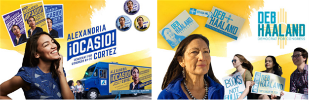
The Game Changer | Alexandria Ocasio Cortez
The fourth-ranking Democrat in the House of Representatives, powerful 10-term incumbent New York Rep. Joe Crowley, was out-hustled and out-maneuvered by Alexandria Ocasio-Cortez, a scrappy 28-year-old grassroots organizer/educator calling for a revolution. Hailing from working-class Bronx with third-generation Puerto Rican roots, this millennial political hopeful’s bid for the House was inspired from grassroots revolutionaries and political activists like Dolores Huerta and Cesar Chavez.
New York-based creative agency Tandem adopted this inspiration, ran with it and fashioned it into a revolutionary-esque aesthetic bent on connecting to voters eager to shake up the establishment. Ocasio-Cortez’ natural presence is captured in photographer Jesse Korman’s portrait of her gazing upward with hope and optimism sparkling in her eyes as a true picture of positive, progressive change. Her self-assured gaze brims with a cool confidence advanced of her years and informed the decision to craft the logo and typography at a forward-leaning angle. Ocasio-Cortez’ thoughtfully nontraditional color palette began with the Brand New Congress, the political action committee that supports Ocasio-Cortez. Its core hue of purple is also represented in Ocasio-Cortez’ hope for bipartisan cooperation in red and blue coming together. Yellow aligns with the theme of positivity and excitement, while blue falls in line with Democratic tradition.
Being female, of Latino heritage and new to elected office — Ocasio-Cortez’s campaign’s DNA is embedded with her youthful exuberance and unapologetic appeal to multiculturalism from the inclusion of bilingual text in all-caps for legibility-sake to the effective speech bubble that frames Ocasio-Cortez’s long last name in an easily-recognizable shorthand reminiscent of Obama.
The Native Hopeful | Deb Haaland
After amassing a war chest of funds and defeating her five rivals two-to-one, Deb Haaland became the first Native American woman elected to Congress in November 2018. The former state Democratic Party chairwoman doesn’t shy away from incorporating powerful symbolism native to her heritage and community into her campaign branding.
With New Mexico’s ongoing troubles with brain drain, poverty, and income inequality hampering the state’s progress and year-after-year poor standing in national rankings, Haaland’s campaign stands out like a bright beacon of hope in a vibrant palette of calming turquoise and optimistic yellow. Incorporating the Zia sun symbol is an ode to Haaland’s Indian name and voters will recognize it from New Mexico’s flag. Representing the circle of life and perfect friendship among united cultures, such potent symbolism is a testament to Haaland’s ongoing defiance to the Trump administration while emphasizing her intention to defund the Immigration and Customs Enforcement agency.
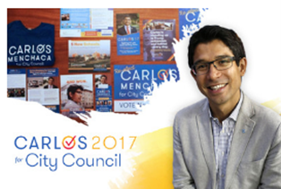
The People’s Champion | Carlos Menchaca
As the first Mexican-American elected official in New York and Brooklyn’s first openly gay office holder, Carlos Menchaca is a trailblazer. Representing Sunset Park, Red Hook, and several other south Brooklyn neighborhoods, the young and energetic city council member is a tireless advocate for immigrant and worker rights, early and adult education, and a more progressive New York.
Menchaca’s infectious passion for his work and natural charisma is reflected in the typeface choices which convey feelings of approachability and friendliness. Grilli Type’s Walsheim, a midcentury sans serif with subtle art deco sensibility, helped to balance out the checkmark, a nod to Menchaca getting things done and the only visual carryover from Menchaca’s 2013 campaign. Inspired by the area’s notable vistas, the sunset-strip motif serves as an ode to Manhattan’s panoramic views and beautiful sunsets. Due to his sheer dedication to the revitalization of Brooklyn’s waterfront on the local level, the symbolism works to Menchaca’s advantage.
After championing the needs of battered Brooklyn neighborhoods in the wake of Hurricane Sandy, the community began to view him as a trusted ally who advocated for their when the rest of the government ignored their needs. That unwavering dedication paid off in dividends with a 20-point margin win in the primary. A success that helped Menchaca snag a second term after securing 80% percent of the vote in the general election.
Political branding is a delicate process prone to missteps and mistakes. In the wrong hands, one bad move or not planning accordingly can spell a campaign’s doom and often, the end of a candidate’s career. These progressive candidates from local to state-level campaigns chose to stray from the patriotic pack by putting their personal stamp on their campaigns. In choosing not to play it safe, this intention quickly set them apart and introduced them to a new swath of voters still hungry for change and to be heard. These trail-blazing candidates are proving to their constituents that it’s not elected office that makes the candidate, but the other way around.
Want to geek out some more of logos? Check of this article on the story behind Obama’s campaign logo.
Have questions around designing an eye-catching logo for your campaign? Ask them here.